"I found GO2 online in a search and was extremely happy with what I found. GO2 rarely needs to return a call since they always pick up. They understood every aspect of what I wanted to accomplish and even offered better ideas and concepts in some areas. No matter how crazy my idea was they either knew how to get it done or they figured it out that day. Owner Timothy Wood's studio is exactly what this business world needs—a company that acts, thinks and produces like a NY ad agency. The big difference is they're always there, things get done fast and their prices were very respectable."
—Matt Dancsecs, Sr. Art Director, Premium Shapes
PRESH MedSpa
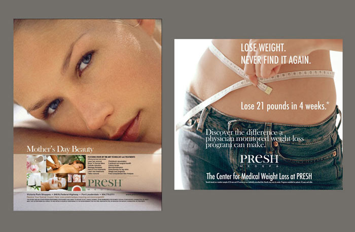
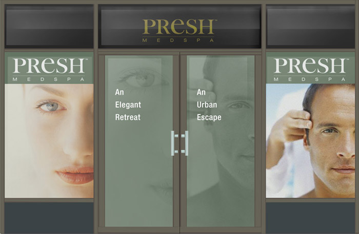
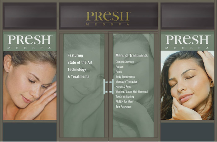
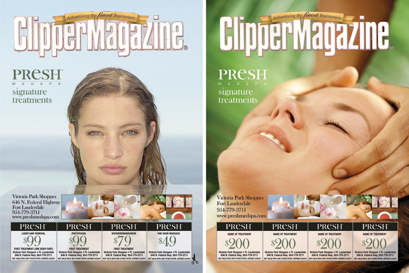
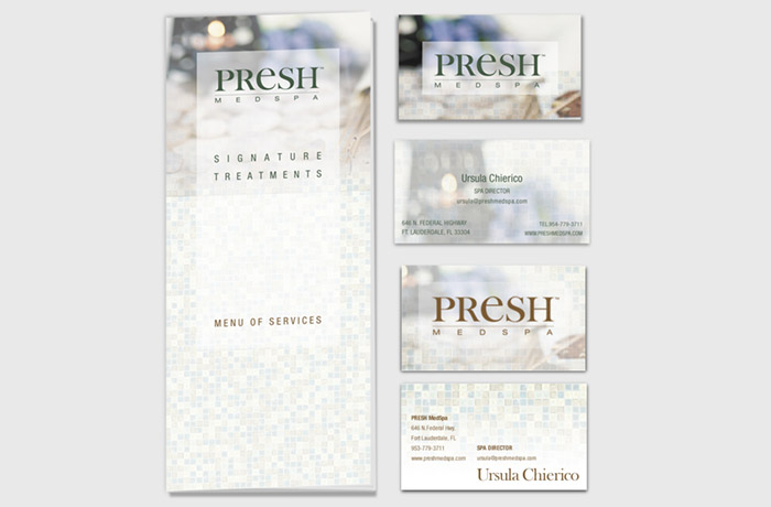
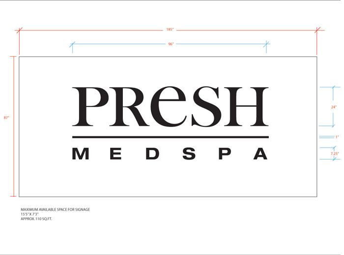
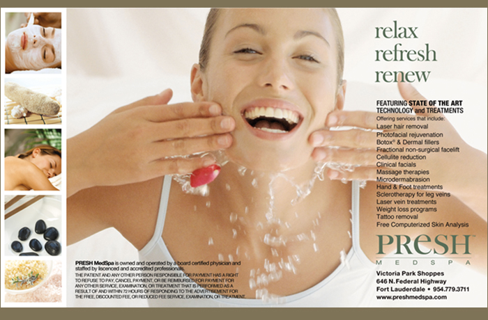
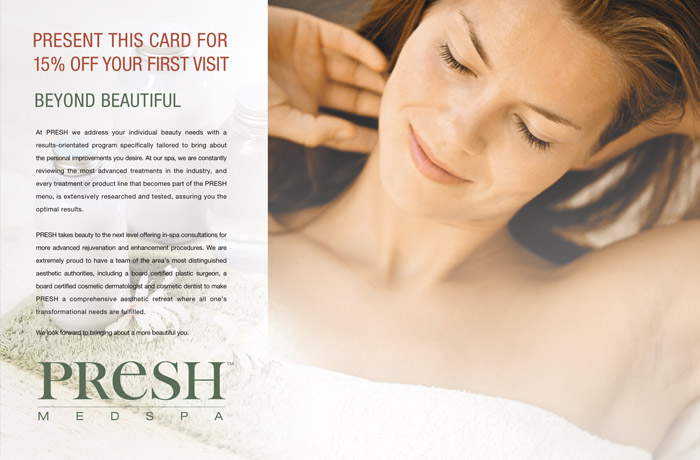
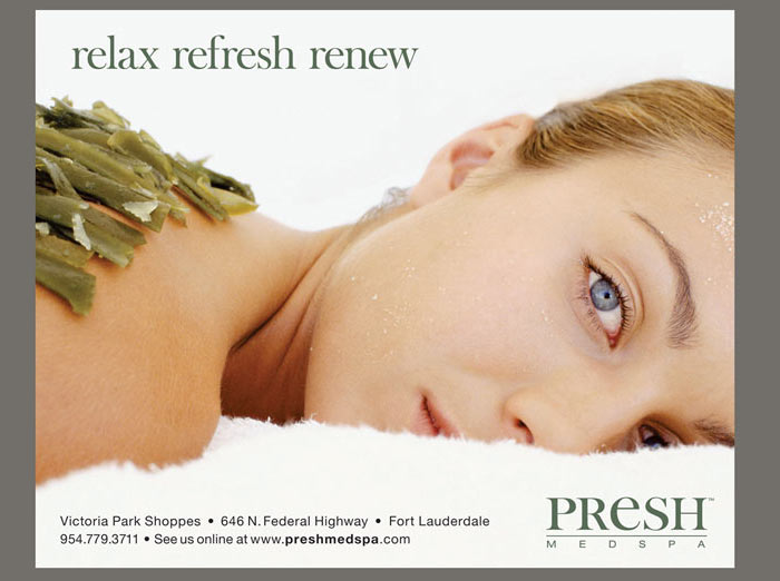
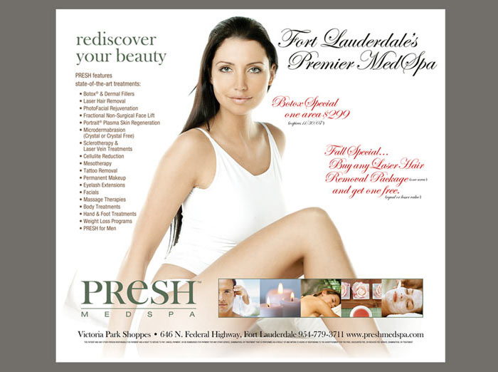
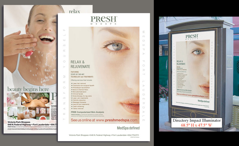
We were sought out to develop a recognizable brand. We started from scratch with only our client's wishes for everything to be "the very best" it could be. There was some hesitation on their part but only because at that point, in early 2006, we had not actually built out an entire brand. We did have experience in building brands, working with established brands, creating style guides for graphic standards, and we had much more to offer that the folks at PRESH quickly found out. They searched across the U.S. on recommendations from existing medspas and other referrals. What made them choose us? Click here to find out.Our first excercise was to develop a color pallette and design a logotype. The name, PRESH, was unique and obviously evoked "fresh". We thought it was a great start and had no reason to change it or suggest anything else. So we began looking at all the major names in fashion, beauty, and cosmetics since we were reaching for that level of sophistication and familiarity. We provided several choices, variations on the central theme of simplicity and refinement. After all, the first PRESH MedSpa was to be in the affluent Fort Lauderdale area. Franchising was part of the plan and we were building this to represent PRESH throughout the U.S. The design we now know as the PRESH logo has been successful as the cornerstone of the brand we built.As we developed that logo, we also began to look at color, which, from our research into the leading established brands, was surprised to find one common use of color - there was none applied directly to logotype design. The majority of them only used Black or White in most of their display and signage, with only some incidental use of color for whatever specific purpose or campaign being promoted. In light of that finding, we suggested that PRESH follow suit but still have an alternate color plus a supporting palette.Since PRESH was in pre-construction, we were ready to get their website online to establish presence and give the marketplace a glimpse of what they would experience at the state-of-the-art MedSpa. We had huge competition online and had to stand up against any of them, without question. Our clients did indeed keep their word and follow every detail to its final version. At times it was very challenging but overall, it was very helpful, and they were open to suggestions—that was instrumental to the success of what we created for them. The PRESH website has been some of our best work to date. It has created awareness, promoted the brand, created the perception of the business accurately, and won awards (Big W Silver '07) for its design.In addition to stationery, business cards, logo and website, we also provided services not typically found from smaller website or graphic design firms. We designed and produced storefront displays for the construction phase of the spa, the design for the exterior store signage, announcement cards, an extensive series of full page color ads, and the PRESH menu of services booklet. Browse the images on this page to see examples.Just starting out and need your brand established? Have a small business and want to make a big impression? Please let us know, we're happy to help.
Our clients say...
|
|
