CW Brown Brochure
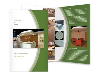
CW Brown redesigned their offices as an example of Green Building. This brochure helped make the public aware of that along with the company's offerings.
Design for print is more traditional of course but still an effective form of advertising. Here are some examples of what we've done on paper.

CW Brown redesigned their offices as an example of Green Building. This brochure helped make the public aware of that along with the company's offerings.
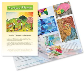
One of the most beautiful pieces we've done owes much of it's appeal to the intriguing artwork displayed throughout this brochure. To promote their website and their cause, the good folks at Barefoot wanted to be able to market offline and have something to put in people's hands. We think that once you see these images, you won't be able to resist having some for yourself.
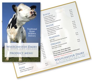
A pricelist does not have to look so plain. We continue building the Westchester Dairy Distributors brand with each piece added to the advertising and marketing of Westchester's very own "Milk Man". The friendly Holstein smiles here on the cover so when visitors get to the website, it's like coming home. While they are there, they can order some fresh, natural milk and other dairy. They deliver to your door. We deliver in print and online. ;-)
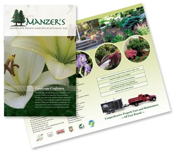
To build a brand there needs to be consistency from element to the next. When your printed pieces reflect your website, there is an immediate recognition that there was some planning involved, that there was thought behind the actions. That carries a lot of weight with consumers since they are used to it. Many small businesses can accomplish that brand building with some very simple planning.
In addition to online marketing of your website, the more traditional methods can help. Print your website address on everything you hand out or leave behind. The advantage is that you don't have to offer so much on paper any longer, but just enough to entice and provoke action.
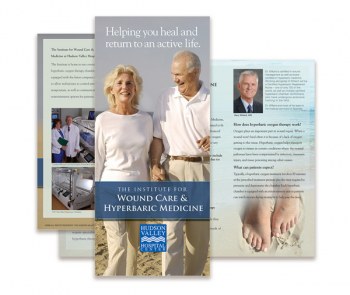
This Brochure was designed for the Hudson Valley Hospital Center in Peekskill, New York. It represents the Hyperbaric Medicine division.
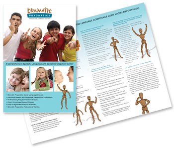
We designed this brochure in tandem with the Dramatic Pragmatics website. We were asked to begin the brand for this unique business and create this marketing piece to complement the website. Playful and colorful, this simple piece echoes the figues used in the logo design with doll model illustrations that portray movement and a range of emotions.
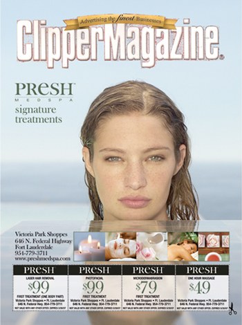
These full color covers we developed to promote the PRESH brand around the South Florida area. We took the series of model based ads and added coupons to accomodate the publication.
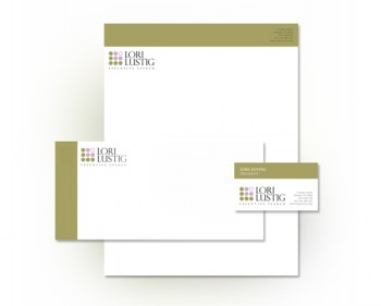
We designed this Corporate Identity for Lori Lustig Executive Search. This was an award winning logo design that inspired a further color pallette and typography for cards, letterhead, and envelopes.
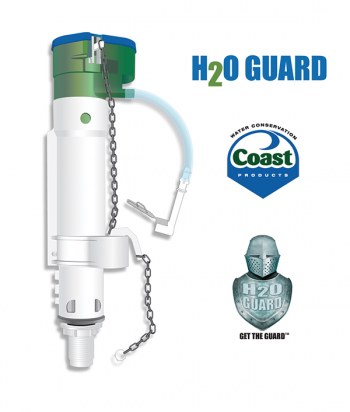
The H2O Guard Pump Illustration is an itegral part of several marketing layouts. GO2 Media Design provides expert technical illustrations. This was created in Adobe Illiustrator.
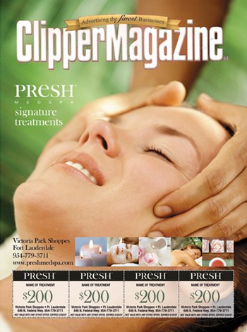
These full color covers we developed to promote the PRESH brand around the South Florida area. We took the series of model based ads and added coupons to accomodate the publication.
|
"GO2 Media Design completely redesigned our site. Patients that visit my website often call me because they say out of all cosmetic plastic surgery sites, mine is the most welcoming, informative, and aesthetically pleasing. Most of the people that visit my website become patients. That's a tremendous return on my investment. I wish I had found GO2 Media Design long before I did. GO2 Media developed and designed style guidelines that created a unified, consistent, and elegant appearance to all my advertising needs. My practice is very personal in its nature, and patients need to feel comfort as well as privacy. The GO2 Media Design studio delivers great design work everytime. They are responsive, intelligent, communicate well, and I always look forward to the next great design." |
When you are looking for Graphic Design or Website Design in the St. Augustine or Jacksonville area, call us to discuss your needs. We provide a wide range of services in both areas.
Confused about how to get your website found in search engines? You should be. Call us for expert advice and proven results with Search Engine Optimization (SEO).
We've worked with some names you might recognize such as New Line Cinema, American Express, and Columbia University, but we work with small and medium size business! We LOVE locals and our rates are affordable.
Call or contact us online today to discuss your next project. We provide consultation and estimates are free of charge.
© 2026 GO2 Media Design, Inc. All Rights Reserved. Web Design St. Augustine and Westchester County NY USA
rev. Monday Mar 23, 2026
