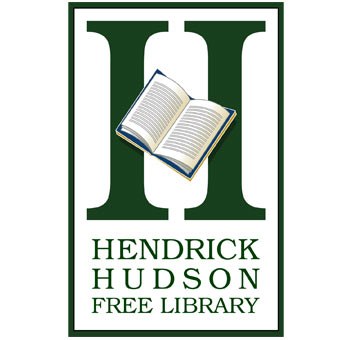
Hendrick Hudson Free Library Logo
A logo doesn't necessarily have to be the same all the time. Some may argue. We see the logo to be an opportunity to identify a business or product but why not have some "extra" fun?
Some things, some places, are hard to describe in a single image. So why not use several? We designed the Hendrick Hudson Free Library logo with a revolving set of images, each to represent another service or material. The vertical strokes of the upper case "H" were perfect for supporting each image acting as the horizontal stroke or "cross bar" to form the letter. It works well, it's fun, and there are many other fun images to use.

