2005

A group of work produced and published in 2005

The Diamond Doctor Society Logo

The most credentialed group of doctors anywhere. The Diamond Doctor Society was developed by Dr. Scott E. Newman for the public to be able to find the most credentialed physicians in all fields of medicine. This rendered logo brand is completely original and created digitally.

SOGO Logo

SOGO Logo design st. augustine

This logo was designed to represent a dynamic drop of sweat. After all, no sweat—no progress. Besides that, it's a memorable image and name, expertly rendered and timeless.

Classic Toy Train Display Logo
Classic Toy Train Display

This is a studio favorite so we keep it around. We also like to show it as an example of some great typography design. It's got a classic feel to it... funny, eh? Well, it is important to us to communicate with images, letters AND words too. Can we really tell an entire story with only one word? It's fun to try. 

If you think about it, each letter is a little picture too. Bottom line: we absolutely love to work with typography. 

Premium Shapes

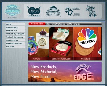
Premium Shapes

Premium Shapes provided unique branded premium promotional items. GO2 Media Design built the customized back end CMS upon specs for look and feel provided by the client.

Fourmen Construction Inc. Logo

Graphic Logo Design St. Augustine

The Fourmen Construction Inc. logo is a throwback to those awesome industrial icons that get embossed into metal. Recognizable yet simple. It's a powerful use of only three letters.

Renaissance Homes

Renaissance Homes logo is a classic and memorable identity for a local contractor speicalizing in single family and townhomes. Just because a company is local, doesn't mean it can't look like a national brand. If you care about your appearance and want to convey to your audience that you took the time, thought, and a bit of an investment in yourself, we feel that translates far beyond words. Have your mark designed by a pro. Show them you care! 

H2O Guard Logo

Logo Designer Saint Augustine

THE GUARD. That's the image for H2O Guard's initial set of products. They represented durability, conservation, and value. The customized armored sentinel was created from many source references and finally rendered as the stylized shield created from a head and chest piece. We originally wanted a stamped look and feel for the typography.

Our clients say...

"Timothy Wood is a true master of visual communication. What sets his work apart is his attention to detail and his mastery in knowing exactly where and how to place those last couple of 'brush strokes' - a drop shadow here, a subtle outline there - that pull the entire concept together and make it pop."
—John Scilipote, Principal, Babyface Interactive, Inc.