2006

A group of work produced and published in 2006

Options in Fitness Logo

Logo Design St. Augustine

How do you show movement and nutrition and health all in one image? When you can't portray a concept or business description literally, we feel it is best to get creative, create something new and forget the literal. Let your supporting marketing collateral cover the details. Options in Fitness icon has become a strong identity for the company and should be for a long time to come. That is the goal, to create the image that is memorable and unique.

Great Tours of Rome and The Vatican
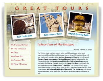
A friend of the studio came to us for advice on what to do with Google AdWords for his website based in Rome, Italy. We were concerned with the look of the site first before we focused on search engine optimization and web search marketing. The site was homemade and not done very well, so we didn't see how visitors could develop any immediate trust. We saw immediate results in traffic converting to inquiries and tours being booked. Once the appearance of the site reflected the attention and care the owner put into his business, it made it possible to use AdWords to increase exposure effectively. The top of the list does not always mean you will see more visitors converting to sales. You must gain the trust of your prospective customers visually.

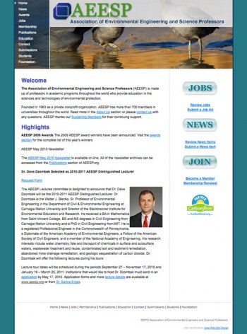
Association of Environmental Engineering and Science Professors (AEESP)

Association of Environmental Engineering and Science Professors

We learn on the job every day. We often take on subjects we are not completely familiar with so we have to learn fast in order to present them effectively. In 2005, we were asked to redesign the AEESP website, mainly to provide a look and feel and develop style sheets. Our successful redesign now brings close to 400 visitors a day from around the world.Our most recent addition was to retrofit a CMS so the membership may post articles, jobs, and news directly to the site, pay online, and give one central admin control over the entire flow. The editing capabilities are simple, direct, and most clients find it rather easy to use. The ability to edit and manage content tends to make the site more current, and that makes the site more attractive to search engines.Visit the site online

Bethel New Horizons

Bethel New Horizons

Bethel New Horizons has been a client of ours from a referral for some time now and we have been fortunate to work such an incredible staff of dedicated and professional people.
Bethel wanted their website updated to reflect their newly designed brochure, rich in color, filled with great photography, and comprehensive in its content. We took all the materials from their printed piece and molded them into a very attractive companion piece online. There are times when simplicity is in order, letting the content shine through while keeping the framework in the background.
We have since redesigned the site as a Drupal CMS. See the latest here.

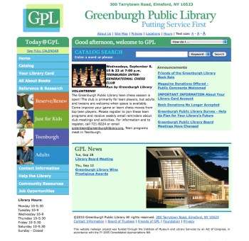
Field Library

Field Library Website

The Field Library website serves the library's patrons in the city of Peekskill. GO2 provides regular maintenance and support for the site. We have provided many updates, additions, and enhancements since 2005. 

Peekskill Properties

Peekskill Properties

We designed the Peekskill Properties website to promote several properties for a local developer. The site was established to build awareness about certain projects in this northern Westchester community and gather information and answer queries about rental properties. Search engine results were on target with many top positions.

Fourmen Construction Inc.

Fourmen Construction Inc.

The Fourmen Construction Inc. website we designed in 2006 was classically simple and stylish. The company was interested in providing a list of services and images to describe exactly what they did. General contracting and commercial buildings were the focus with many examples displayed and described. In addition, a comprehensive contact information section was built to provide access to every level of the business from maintenance to administrative.

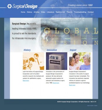
Surgical Design

Surgical Design - The worlds leading innovators in Intraocular Microsurgery

Surgical Design is reaching out to a global marketplace providing advanced surgical systems for cataracts and vitrectomy surgery since 1968.

We wanted to create a site that reflected their existing marketing collateral consisting of sell sheets and brochures. It is very technical in nature so we wanted to present it in a way that was easy to navigate, easy to read, and visually stimulating. The site contains an online troubleshooting guide added recently providing valuable information to their client base where they previously had to send out paper versions by mail.

The Surgical Design website was awarded a Big W from the Advertising Club of Westchester in 2009 for Interactive Media: Business to Business website.

Our clients say...

"Our website has become part of our daily routine, we post specials and sides for the day, which cuts down on phone calls from our regular customers. We can easily change prices per item which prevents any difference from our printed menu."
—Judy Butcher, Owner, Schooner's Seafood House, St. Augustine, FL