"Timothy Wood is a true master of visual communication. What sets his work apart is his attention to detail and his mastery in knowing exactly where and how to place those last couple of 'brush strokes' - a drop shadow here, a subtle outline there - that pull the entire concept together and make it pop."
—John Scilipote, Principal, Babyface Interactive, Inc.
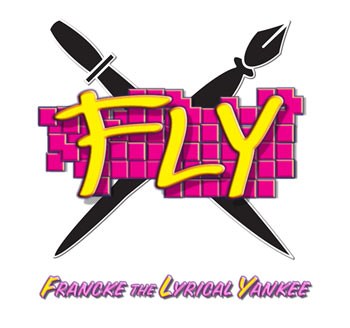
Francke The Lyrical Yankee Logo

FLY stands for Francke The Lyrical Yankee. Our client is a "rhymer" and quite prolific in her writing and rhymes. She has recorded her own debut collection of original work and is actually quite different because she is a senior artist competing in a rather youthful arena. We believe she holds her own as a storyteller and an entertainer.
She chose the classic pen and the sword as symbols in her logo and we added a dash of a hip-hop grafitti style, featuring her favorite hot pink. She is always promoting and very in tune with the latest viral marketing vehicles including CD Baby, Cafe Press, and her own website/blog.
Our clients say...
|
|
