"Yes, I would highly recommend (Timothy Wood Design) GO2 Media Design. Believe it or not, Tim and I have never met but we worked together for quite some time on the site. ...Easy to work with, professional and I'm sure he would create a wonderful website..."
—Veronica Whitehead, Global Event Planner
2004
A group of work produced and published in 2004
SembleTech
The SembleTech logo was for a division of an Internet service provider in Westchester county, New York. They began to offer workstations with preloaded software for companies. The image represents "fitting together" in a bold way.
SembleTech Logo
SembleTech Logo was created for a workstation service company. The service involved setting up workstations in business environments and supplying them with software applications to be updated remotely, keeping the entire package current and state-of-the-art. "Assembled Technology" was the core concept.
Spiritual Java
Spiritual Java was a unique program of yoga and nutrition developed by Marilyn Diamond, Co-Author of the visionary 70's mega-bestseller, Fit for Life.
This brand ID was a composite of one original photograph (the hand), an original illustration (the jewel), and the typographic icon "SJ" within the jewel image.
Anti-Aging Plus
We have taken Anti-Aging Plus from a very basic, mom-n-pop type look and feel, and transformed it over time into a professional looking, online retail website. We have been working closely with the owners since 2003 and have been able to offer many services in addition to designing their website and providing SEO and SEM.
We branded their company with the current logotype and packaging style and have delivered various marketing elements such as trade show banners, cards, and labeling for each product. We are always happy when we are able to offer our experience in marketing and advertising on multiple levels.
Hendrick Hudson Free Library
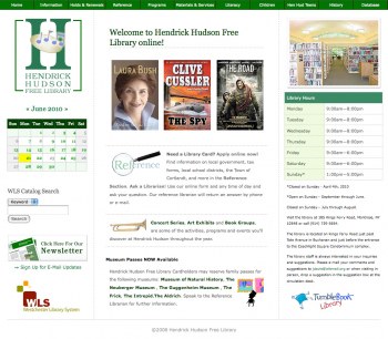
We have been working with "Hen Hud" for about 5 years now and have recently completed converting the website to a full CMS using Drupal. The site now has multiple levels of access for separate users to add and edit content.
Each librarian can contribute to their specific section in addition to the general calendar of events. Printer-friendly and e-mail forwarding of pages has been added plus all forms are now created within the application.
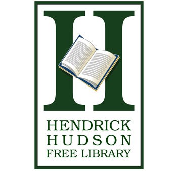
Hendrick Hudson Free Library Logo
A logo doesn't necessarily have to be the same all the time. Some may argue. We see the logo to be an opportunity to identify a business or product but why not have some "extra" fun?
Some things, some places, are hard to describe in a single image. So why not use several? We designed the Hendrick Hudson Free Library logo with a revolving set of images, each to represent another service or material. The vertical strokes of the upper case "H" were perfect for supporting each image acting as the horizontal stroke or "cross bar" to form the letter. It works well, it's fun, and there are many other fun images to use.
Our clients say...
|