SOGO Logo
This logo was designed to represent a dynamic drop of sweat. After all, no sweat—no progress. Besides that, it's a memorable image and name, expertly rendered and timeless.
A group of work produced and published in 2005

This logo was designed to represent a dynamic drop of sweat. After all, no sweat—no progress. Besides that, it's a memorable image and name, expertly rendered and timeless.
This is a studio favorite so we keep it around. We also like to show it as an example of some great typography design. It's got a classic feel to it... funny, eh? Well, it is important to us to communicate with images, letters AND words too. Can we really tell an entire story with only one word? It's fun to try.
If you think about it, each letter is a little picture too. Bottom line: we absolutely love to work with typography.
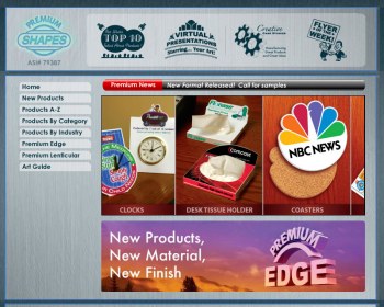
Premium Shapes provided unique branded premium promotional items. GO2 Media Design built the customized back end CMS upon specs for look and feel provided by the client.

The Fourmen Construction Inc. logo is a throwback to those awesome industrial icons that get embossed into metal. Recognizable yet simple. It's a powerful use of only three letters.

Renaissance Homes logo is a classic and memorable identity for a local contractor speicalizing in single family and townhomes. Just because a company is local, doesn't mean it can't look like a national brand. If you care about your appearance and want to convey to your audience that you took the time, thought, and a bit of an investment in yourself, we feel that translates far beyond words. Have your mark designed by a pro. Show them you care!
THE GUARD. That's the image for H2O Guard's initial set of products. They represented durability, conservation, and value. The customized armored sentinel was created from many source references and finally rendered as the stylized shield created from a head and chest piece. We originally wanted a stamped look and feel for the typography.
The most credentialed group of doctors anywhere. The Diamond Doctor Society was developed by Dr. Scott E. Newman for the public to be able to find the most credentialed physicians in all fields of medicine. This rendered logo brand is completely original and created digitally.
|
"Dear Tim, and staff, We just want to thank you for the hands on and professional attention we received during the design and implementation of our two business websites. The sites came out beautiful and we couldn't be happier, your company is top notch! Almost immediately after the sites went live we noticed an increase in website traffic and referrals, your search engine optimization allows our sites to post high on search results for a large number of keywords. Your back end website programming not only ensures website functionality but also allows us to easily upload new photos and track where our website traffic originated from, this has proven to be a valuable asset in streamlining our advertising. We are glad we decided to upgrade our old sites and very happy we found a good company to handle the job properly." |
When you are looking for Graphic Design or Website Design in the St. Augustine or Jacksonville area, call us to discuss your needs. We provide a wide range of services in both areas.
Confused about how to get your website found in search engines? You should be. Call us for expert advice and proven results with Search Engine Optimization (SEO).
We've worked with some names you might recognize such as New Line Cinema, American Express, and Columbia University, but we work with small and medium size business! We LOVE locals and our rates are affordable.
Call or contact us online today to discuss your next project. We provide consultation and estimates are free of charge.
© 2025 GO2 Media Design, Inc. All Rights Reserved. Web Design St. Augustine and Westchester County NY USA
rev. Sunday Mar 09, 2025
