Portfolio

Our portfolio contains many examples of award winning website design, graphic design, and logo brand design. Navigate through these pages using the links below the images to view work in groups by category. Please page through the examples using the numbers below or skip to specific categories with the links associated with each example.

Splendid! Software Website Design

Splendid! Software Website Design

Ripe from the vine, this one's a funny one... until you read a bit deeper. Splendid Software is a lovely name for a very hardcore company of programmers and strategic thinkers. We know first hand, we work with Splendid Software and JKS regularly. They are fun which is always welcome but also dependable, reliable, and really really good.

Fieldstone Money Management

Fieldstone Money Management

Fieldstone Money Management provides experienced financial services in the tri-state area. A simple business website was exactly what was needed as a presence online. No need for CMS since the owners knew they were only going to update content occasionally. The website design portrays Fieldstone as a trusted source for sound advice and a warm welcome.
See the site online now.

Moretti Landscaping

Moretti Landscaping

One of our most successful sites is Moretti Landscaping. Its success for us is due to the business it brings to our client. Search Google for "landscape services", or "landscape design" in Westchester and you will likely find Moretti's website, just as so many of their prospective clients have done.
When you do visit morettilandscaping.com, you will find a variety of examples of their impressive work converting property, parks, and plain old yards into fantastic landscapes using masonry, plantings, lawns, and a variety of materials.
Mr. Moretti invested in his business and it has paid off handsomely as customers continue to find him online and he competes with any other landscape company in the area.

Salem Fence Company

Website Design St. Augustine

Salem Fence Company was in need of a new website where they could have an easy time of communicating with customers online and pointing out certain images. We built out a Drupal CMS website for them to be able to upload and categorize any and all photos of their work, and keep their numbering system intact so they didn't have to change the way they labled them.

The site is fully optimized for SEO, beautifully designed, and working well with high usability.

ARCOM Space Planning

ARCOM CMS website from GO2 Media Design

We have many interesting clients and learn more all the time. Patti Bancone of ARCOM came to us by way of The Gold Standard, a strategic partner of ours, and the results are fantastic.The site is visually rich but clean and consistent. What else would you expect for a space planning expert? It is an ongoing challenge to portray the level of expertise and committment from a company through a two dimensional website.The portfolio page is a highlight with expanded use of Lightbox to allow close-up views of plans.Visit the site at www.ArcomSpacePlanning.com

Westchester Automated Gate

web design examples, graphic design portfolio websites

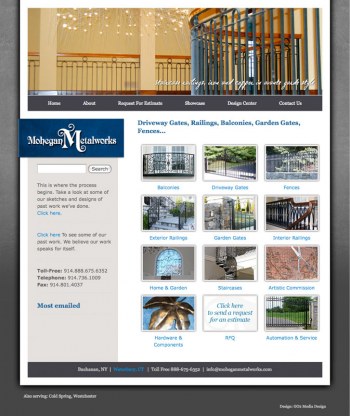
We provided a Drupal CMS website to showcase the variety of gates and fences. Drupal-specific views and taxonomy were implemented to organize and present a gallery of sample images in an orderly and easy-to-navigate user experience. Our unique SEO kept top positions in search results pages.

Creative Illuminations

Creative Illuminations

Creative Illuminations is a supplier of lighting fixtures. Our assignment was to build a basic business site that would be found in search engine results. We were also given the task of making it unique and stylish. We feel it's a bright spot in our portfolio.
View the site online

Morgan Construction & Cabinetry, Ltd.

Morgan Construction & Cabinetry, Ltd.

When we saw the type of work they did, we were very excited to design the website for Morgan Construction & Cabinetry, Ltd. The success of a showcase site such as this relies heavily on photography and we were fortunate to have many source images. Of course it also depends on how those images are displayed.
We often aim to design marketing support that reflect the quality or level of service that our clients provide. For Morgan, this meant we would be designing an exquisite website. We go the distance for all of our clients just as they do for theirs.
We redesigned again recently in 2015 as a responsive site.
Browse the site live online. 
 

Dance Expression

Dance Expression

The owners of one of the most successful dance studios in Westchester came to us to have their existing website redesigned. Dance Expression of Westchester had a CMS website that was difficult to use and somewhat limited in its functionality. Although it provided information about the studio, it was not presented in a way that reflected the artistry and refinement of this popular dance school.

We took some specific directions regarding color and content and came up with an engaging style for this state-of-the-art CMS website. This site's administrative functions allow the Dance Expression staff to update their site with ease from anywhere with an internet connection. Schedules, instructor bios, photo galleries, and video clips are all easily found by visitors.

The Gold Standard

The Gold Standard

Redesign. Redevelop. Reorganize. Relief! This site packs a punch and that should be apparent from the very first view. We wanted to match the incredible depth of this Westchester, New York, PR firm with a presentation that communicates their level of expertise with style, high usability standards, and an overall experience that leaves visitors with only one thing on their minds, "Where do we sign up"? (It's actually easy to find so they won't really have to look very far...)For our friends at The Gold Standard, they now have a state-of-the-art CMS website that allows them to easily rewrite content and create press releases with images that are categorized by client, automatically archived, and offered in a stylized printer friendly view.Visit the site online.

COAST Water Control Products

St. Augustine Website Design | GO2 Media Design

COAST began for us in 2003 when we designed a logo for the H2O Guard company. We created illustrations of the products as part of the overall packaging. The company purchased COAST manufacturing and foundary in 2008 and H2O Guard products were adopted into the product. The COAST name was retained and is now COAST Water Control Products.

H2O Guard and GX3 (Green times three) are product brand identities we have designed along with the new COAST logo. The new COAST website is also online now with plans to be built out to contain product, instructions, news, environmental interests, green friendly resources, and other related information.

Pages

Our clients say...

"Our website has become an integral part of our business."
—Rich Greenwald, President