Portfolio

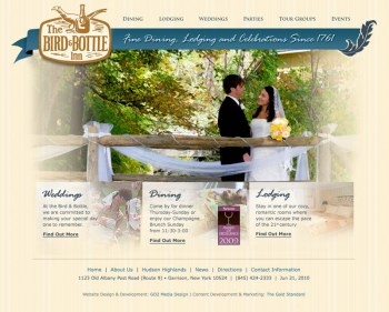
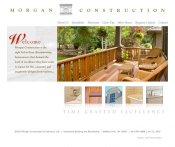
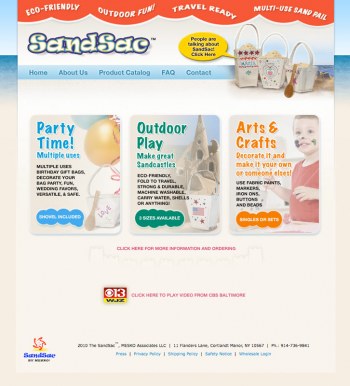
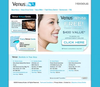
Our portfolio contains many examples of award winning website design, graphic design, and logo brand design. Navigate through these pages using the links below the images to view work in groups by category. Please page through the examples using the numbers below or skip to specific categories with the links associated with each example.

Green Design Expo LLC

web design examples, graphic design portfolio websites

Green Design Expo LLC is a sign of the times. For people that want to find the latest, best, and most effective solutions for green living and green building, GDE is a fantastic resource. We are definitely fans of alternative energy sources and through companies like GDE, realize how beautiful some of the green products can be. There is a great fusion of design, practicality, and consideration for the materials used.

The site is a Drupal site, of course- most of our sites now are Drupal CMS. We built in a custom region for the home page to display upcoming events that are mostly hosted in the store and occasional lectures or demonstrations in the community. We have put an E-News function in place allowing GDE staff to send out announcements easily through their site. There will be much information coming from this site so RSS feeds will serve them well as most of the staff will be blogging for the site.

The theme is actually built using actual transparent PNG files, layered to create the incredible depth of color and feeling of space. The website does achieve the primary goal, portraying the store quite accurately, as was the wish of our client. The intent was to present the company's services and products in a contemporary and intelligent light.

Knowing Science

Website Design in Saint Augustine FL

Knowing Science is a new science curriculum for Pre-Kindergarten through Second grade students. Designed for the classroom or homeschooling scenarios.

We had the great fortune of being selected to develop illustrations and the eventual website for this new science curriculum that teaches science standards at the earliest levels of education. We love science and technology and we're all for better education for everyone, a win-win situation.

The site uses Drupal CMS to provide flexible content creation, editing, and management. The e-commerce engine is provided by Ubercart, which we feel is one of the most streamlined and efficient shopping cart experiences. The look and feel of the site was intended to be clean and uncluttered leaving focus directly on the subject and not the site itself.

We got them started online. Visit the site online at knowingscience.com

Dominique Apparel

St. Augustine Website Design | GO2 Media Design

One of the most challenging sites to design is one where the content already exists in print. We designed the interface of this CMS site to accommodate our clients' varied line of garments to be universal while allowing the comprehensive array of sizes, styles, and colors.

We needed to create a unique look and keep the entire content area within a specific height. The color and design of the layout was intended to suggest a female shape without being literal or cliche. The target audience was dual purpose, mostly trade but also intended to create awareness among consumers.

Visit the site online at dominiqueapparel.com

Experts in Spine Surgery New York

St. Augustine Website Design | GO2 Media Design

Doctors and surgeons are probably the most important people at some point in each of our lives. Anyone that has had their life changed or saved by them would attest to that. Promoting and marketing their expertise and skills is necessary as well. The look and feel for a website is critical to its success, as we like to call it, the "visual trust" created by the color and design of a website will tend to pull the visitor inward and engage them.

Some subjects such as medicine in general, already have certain colors and other design elements associated with them and in some cases also have some rather negative connotations. In the case of a surgeon, we wanted to evoke a feeling of comfort and warmth. Staying away from the usual cool blue-green, teal, aqua color families was our motivation for the palette used here. Along with the basic color, the rest of the layout and photographic elements needed to fit within that scheme without competing for attention. We welcome all challenges in color and design whether you have an established brand identity or are a new business starting up from scratch.

One unique use of this Drupal CMS website is the patient forum. See the live site at expertspinesurgeons.com

College Connection

College Connection

"Ask Suzan" and you'll get one of the most informative and valuable answers ever. College Connection adds further expansion to our portfolio and our own education. Here is a website that deals with test preparation, college application writing, and ultimately choosing a school that best suits the individual student. We have done our share of work with colleges and universities but this was a new angle.
Our assignment was to create a website using an existing brand, provide content management, and allow limited access to proprietary content. When their clients sign on, they are given materials to help organize and manage the process of creating an optimal list of possibilities based on many criteria. That used to be done in person in the form of printed materials. Now it has an online counterpart thanks to the incredible Drupal CMS functionality and some fundamental usability.
Video clips, photo galleries, and much more is now available for our clients to easily share with their clients and prospects. (note. site was retired in 2014)

Patient Wear

Patient Wear Website

Patient Wear provides innovative garments for patients with limited range of motion and other conditions requiring partial removal. 

A Drupal framework supports the presentation and e-commerce allowing visitors to learn about and purchase these incredible garments.

Moretti Landscaping

Moretti Landscaping

One of our most successful sites is Moretti Landscaping. Its success for us is due to the business it brings to our client. Search Google for "landscape services", or "landscape design" in Westchester and you will likely find Moretti's website, just as so many of their prospective clients have done.
When you do visit morettilandscaping.com, you will find a variety of examples of their impressive work converting property, parks, and plain old yards into fantastic landscapes using masonry, plantings, lawns, and a variety of materials.
Mr. Moretti invested in his business and it has paid off handsomely as customers continue to find him online and he competes with any other landscape company in the area.

Salem Fence Company

Website Design St. Augustine

Salem Fence Company was in need of a new website where they could have an easy time of communicating with customers online and pointing out certain images. We built out a Drupal CMS website for them to be able to upload and categorize any and all photos of their work, and keep their numbering system intact so they didn't have to change the way they labled them.

The site is fully optimized for SEO, beautifully designed, and working well with high usability.

ARCOM Space Planning

ARCOM CMS website from GO2 Media Design

We have many interesting clients and learn more all the time. Patti Bancone of ARCOM came to us by way of The Gold Standard, a strategic partner of ours, and the results are fantastic.The site is visually rich but clean and consistent. What else would you expect for a space planning expert? It is an ongoing challenge to portray the level of expertise and committment from a company through a two dimensional website.The portfolio page is a highlight with expanded use of Lightbox to allow close-up views of plans.Visit the site at www.ArcomSpacePlanning.com

Westchester Automated Gate

web design examples, graphic design portfolio websites

We provided a Drupal CMS website to showcase the variety of gates and fences. Drupal-specific views and taxonomy were implemented to organize and present a gallery of sample images in an orderly and easy-to-navigate user experience. Our unique SEO kept top positions in search results pages.

Pages

Our clients say...

"Thanks to you and the amazing job you have done for us, we are getting more inquiries for our event services each week than we received in the entire past year from our old site. Our new web site is not only beautiful, but easy for clients to see what we are about and easy for them to select the information they are looking for, then contact us directly."
—Elaine Margolies, Owner, Innkeeper