Portfolio

Our portfolio contains many examples of award winning website design, graphic design, and logo brand design. Navigate through these pages using the links below the images to view work in groups by category. Please page through the examples using the numbers below or skip to specific categories with the links associated with each example.

Schooner's Seafood House

St. Augustine Web Design | GO2 Media Design

Responsive website design is quickly become the ultimate standard for everyone. Technology advances quickly in delivering content and responsive methods make sure your website will display properly on any device screen. The user experience is key to success of displaying content to be easily read on any device. Responsive elements will transform navigation so that it seems natural according to the device whether it is a smartphone or a desktop computer.

Look at this site on your phone, a tablet, and then a desktop computer to see how it transforms to each of those screens. One site will look great on any device automatically.

Visit this site online

Simon Collins Creative Director

Video Website Design in Saint Augustine

This site is a redevelopment of an older, Flash-heavy site that we redesigned as a Drupal 7 Responsive site. This change alliowed visitors to view on mobile devices and tablets but also allowed the owner to created and edit content through the customized Drupal 7 user interface. Our client has a variety of excellent print, online, and video work to display.

Look at this site on your phone, a tablet, and then a desktop computer to see how it transforms to each of those screens. One site will look great on any device automatically.

Visit this site online

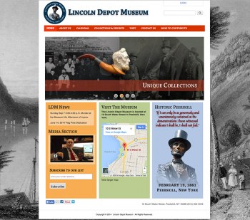
Lincoln Depot Museum
St. Augustine Website Design | GO2 Media Design

We provide consulting for website development on any scale. Whether you have an existing site that needs reworking or replacing, or something new and original, we have 20+ years experience and the creative spark you're looking for.

This site was beautiful when we designed it and looked great on your phone, a tablet, or desktop computer. A responsive website will look great on any device automatically.

When clients allow us to be their experts, we do our best work.

Higher Ed Responsive Website for Pace University

Web Design for Higher Education

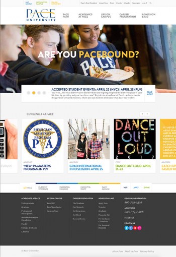
When it comes to packlng six schools and thousands of pages of articles, documents, instructions, directions, courses, staff, faculty, and admissions information into a website for a university, Pace.edu covers it all. This massive Drupal site was a phenomenal redesign effort that took many separate school sites and combined them into one seamless experience. This site is used as the main marketing vehicle for admissions as well as a deep source for information pertaining to this New York university with two separate campuses plus a law school. There are over 200 editors that manage their own areas on this site. It's big, it's beautiful, and it's one we've had a big hand in getting online with much sucess.

Ridgeview Designer Builders

Ridgeview Designer Builders

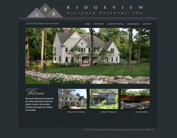
Websites give businesses the advantage of showing what they do to the rest of the world. Many photos of their work make Ridgeview Designer Builders' website a fantastic showcase of craftsmanship and design. Most of us would love to inhabit any of the houses they build. Browse the website, you will be impressed.

This site is built on Drupal 7 with a custom theme with heavy use of Views and Views Slideshow.

Wooded Acres Custom Homes

How do you sell homesites online? Many beautiful photos. Wooded Acres Custom Homes website showcases a beautiful, new 16-lot subdivision in Westchester county. Simplicity is the key to this new online presence.

This site was built on Drupal 7 with a custom theme with heavy use of Views and Views Slideshow. The site has since been retired once the properties were sold.

SOUND

SOUND

SOUND is a website that will grow on you. Organic looking, easy to navigate, and loaded with interesting bits of content—this site is one of our finest e-commerce websites. We look forward to watching the site grow along with this new business. 

Felicity Darcy

Felicity Darcy

Sometimes the subject matter of a site is the predominant look of the site and sets the style. Felicity Darcy is a website that is elegantly simple, letting the glimmering, shimmering silver and glass jewelry stand out. This Drupal 7 E-Commerce began taking orders the day it was published and we were thrilled to see it happening. Take your business online and show it to the world. Ask us how.

Lansing Public Library

Lansing Public Library

The Lansing Public Library website serves the library's patrons in the town of Lansing, New York. GO2 provides regular maintenance and support for the site. We have provided many updates, additions, and enhancements since 2012. 

Bethel New Horizons

St. Augustine Website Design

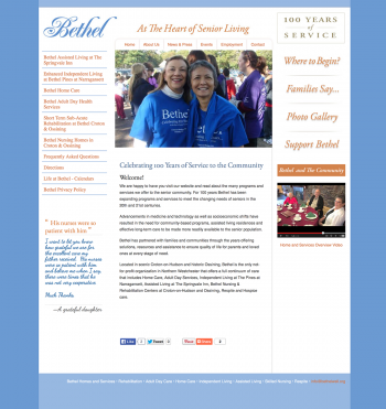
Bethel New Horizons has been a client of ours from a referral for some time now and we have been fortunate to work such an incredible staff of dedicated and professional people.

We redesigned their website in 2006 (see it here) and then six years later, we converted it to a Drupal CMS site. The improvement allows staff to update photo galleries, add events, and improve their presence online. Since Drupal is modular and flexible, we can add content with ease and provide valuable content to increase exposure to search results.

We'd encourage you to visit the site online however another redesign by another company is atrocious. Marketing based on data alone is cold and unfeeling and wholly inappropriate for some clients. People notice and it matters.


Deborah Druick

Responsive Website Design in Saint Augustine

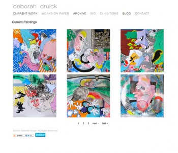
"What a cool site" That's what we thought when we were first approached to design this. When you have such incredible and interesting works of art as subject matter, the job becomes fun and the rest just follows. Simplicity in design is not always easy to obtain with many temptations to "add this" or "do that". Here is a website design that cuts through to the subject- and leaves nothing to guesswork.  

The site is built on the Drupal CMS platform allowing for our client to easily add to her galleries, specifying size, date, etc., with ease. The homepage is a fun mixture of cropped versions of all the artwork on the site that creates a unique layout each time the page is refreshed. Go ahead and try it- see what you come up with for a layout. 

Visit the site online

Experts in Spine Surgery New York

St. Augustine Website Design | GO2 Media Design

Doctors and surgeons are probably the most important people at some point in each of our lives. Anyone that has had their life changed or saved by them would attest to that. Promoting and marketing their expertise and skills is necessary as well. The look and feel for a website is critical to its success, as we like to call it, the "visual trust" created by the color and design of a website will tend to pull the visitor inward and engage them.

Some subjects such as medicine in general, already have certain colors and other design elements associated with them and in some cases also have some rather negative connotations. In the case of a surgeon, we wanted to evoke a feeling of comfort and warmth. Staying away from the usual cool blue-green, teal, aqua color families was our motivation for the palette used here. Along with the basic color, the rest of the layout and photographic elements needed to fit within that scheme without competing for attention. We welcome all challenges in color and design whether you have an established brand identity or are a new business starting up from scratch.

One unique use of this Drupal CMS website is the patient forum. See the live site at expertspinesurgeons.com

Pages

Our clients say...

"I just wanted to tell you that I was very excited to see us come up in google on the first page if you google westchester and pragmatics."
—Alexandra Laufer Lobo, M.S., CCC-SLP